Colour Drenching Your Living Room: Making a Small Space Feel Bigger with One Cohesive Palette
Thinking about colour drenching your living room? We explain how it works, what colours suit Newark homes, and how to get a flawless finish on walls, woodwork and ceiling.

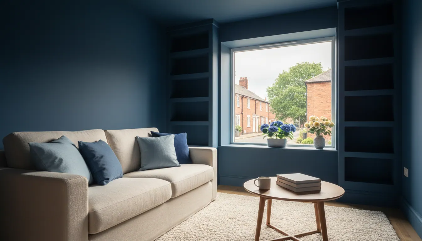
What colour drenching actually is, and why it works so well in a living room
Colour drenching is simple enough as an idea: you paint every surface in the room the same colour, or very close tonal shades of it. Walls, ceiling, skirting boards, architraves, door frames, the lot. No contrasting white woodwork. No ceiling break. Just one continuous envelope of colour that wraps the whole room.
It sounds bold. In practice, it is one of the most forgiving and satisfying decorating approaches you can take, especially in a living room where you want the space to feel settled and deliberate rather than piecemeal.
The reason it works is to do with how the eye reads a room. White skirting boards and a white ceiling create hard visual boundaries that chop the room into sections. Drench everything in the same tone and those boundaries dissolve. The room reads as one cohesive space, which makes it feel larger, calmer, and much more considered.
We do a fair amount of this kind of work across Newark-on-Trent and the surrounding villages, and it has become genuinely popular. Homeowners who were nervous about committing to colour often find that drenching is actually easier to live with than a feature wall ever was.
Is colour drenching still relevant in 2026?
Yes, and it is not going anywhere soon. What has changed is the palette. A few years ago, drenching tended to mean deep, moody shades: dark greens, inky blues, charcoal. Those still look brilliant in the right room, but the trend has broadened considerably.
Right now, the colours we are seeing homeowners in Newark choose most often for living rooms are:
- Warm sage greens. They work in both period semis and modern builds. They hold their warmth in lower light and feel relaxed without being dull.
- Soft clay and terracotta tones. Particularly good in older terraces where the walls have a slight texture and the light comes from one side.
- Heritage blues and slate blues. Cooler, quieter, and very effective in rooms with south-facing light. They need more care in north-facing rooms (more on that below).
- Warm greiges and putty shades. Not quite cream, not quite grey. These suit homes where the existing furniture is a mix of periods and you want a backdrop that ties everything together without dominating.
The key for 2026 is that people are moving away from cold, flat greys and towards anything with warmth in the undertone. That shift suits Newark's housing stock particularly well, where a lot of living rooms have bay windows, coving, and period details that look better in warmer light.
Colour drenching in a smaller living room: does it actually help?
This is a question we hear regularly, especially from homeowners in Balderton, Fernwood and Collingham where the living rooms in newer builds can be fairly compact.
The honest answer is yes, drenching tends to make a smaller room feel better proportioned, not worse. When you remove the contrast between walls, ceiling and woodwork, the room stops feeling like a box with clearly defined edges. The ceiling does not feel low. The corners do not feel tight.
The one thing to be careful about is shade depth. Very dark colours in a genuinely small room with limited natural light can feel oppressive rather than cosy. In those situations, we usually suggest going one or two shades lighter than your first instinct. You can always go deeper on the next repaint once you have lived with the lighter version. A mid-tone sage or a soft warm stone in a small room will give you all the drenching effect without closing the space in.
North-facing rooms and low-light living rooms: what to choose
A lot of Newark's older terraces and Victorian semis have living rooms that face north or north-west. The light in those rooms is cool and consistent, which is lovely in many ways, but it does mean certain colours shift significantly between morning and evening.
Cool greys in a north-facing room can look almost blue by mid-afternoon. Flat whites look stark. Pale lilacs can read as dingy.
What works in low-light rooms:
- Warm whites and off-whites with a yellow or pink undertone rather than a blue one
- Soft greens with a yellow-green base (think lichen or sage rather than teal)
- Warm putty and parchment tones
- Any colour described as "warm" or "honey" in the undertone
If you are unsure, the single most useful thing you can do before committing is to paint a large test patch directly on the wall and look at it at different times of day. Not a small tester pot square. A genuinely large section, at least a metre square if you can manage it. Colours behave very differently on a large area than they do on a small chip.
The rules for colour drenching: what actually matters
There are no strict rules, but there are a few things that make the difference between a drench that looks professional and one that looks unfinished.
Use the same colour on every surface, or a coherent tonal range. Some people go exactly the same shade throughout. Others use the mid-tone on walls, a slightly lighter version on the ceiling, and the deepest version on the woodwork. Both approaches work. What does not work is choosing colours that are close but from different undertone families, because they will clash in certain lights.
Do paint the skirting boards. This is the question we get asked most often and the answer is yes, absolutely. The whole point of colour drenching is that the skirting boards and architraves disappear into the wall. If you leave them white, you have not drenched the room, you have just painted the walls a dark colour. The skirting boards are what makes the technique work.
Prepare the woodwork properly. Skirting boards that have been painted gloss for twenty years need to be keyed back before you put any new colour on them. If the surface is not prepared, the finish will be uneven and the colour will look patchy. This is the part of the job that separates a professional finish from a DIY one.
Think about your finish. A full gloss on the walls and woodwork will look very different from an eggshell throughout. For a living room, most people find that an eggshell or satin finish on the woodwork and a matt or soft sheen on the walls gives the most pleasing result. It keeps the warmth in the colour without making the room feel like the inside of a tin.
If you want to read more about getting the woodwork right, our guide on glossing woodwork without splashes covers the preparation and protection side in detail.
What a professional finish looks like in practice
When I take on a colour drench in a living room, the preparation takes longer than the painting. Filling any cracks or holes, rubbing back the existing woodwork, masking off where the skirting meets the floor, sheeting the furniture and carpet. All of that happens before a single drop of paint goes on the wall.
The order matters too. Ceiling first, then walls, then woodwork last. Cutting in carefully at every junction. Two full coats on each surface, with the right drying time between them. It is not complicated, but it does require patience and attention to detail at every stage, particularly on the woodwork where any drips or holidays in the coverage will catch the light.
The result, when it is done properly, is a room that looks like it was always meant to be that colour. That is the thing customers tend to notice first: not that the room looks decorated, but that it looks right.
One of our customers put it well after a recent living room job:
It's made a big difference to our living room, looks super fresh now.
That is from Julie, who had us repaint her lounge including the walls, ceiling, pelmets and skirting boards. A complete drench, and exactly the kind of result this technique delivers when the preparation is thorough and the colour choice suits the room.
For more on what a full sitting room repaint involves from start to finish, take a look at our article on refreshing your sitting room.
Frequently asked questions
Should I colour drench my living room? If you want the room to feel more cohesive, calmer, and larger, it is worth seriously considering. It works particularly well in living rooms with period features like coving and skirtings, because painting everything the same tone makes those details feel intentional rather than dated. The main thing is to choose a colour with the right undertone for your light conditions.
Do you paint the skirting boards when colour drenching? Yes. This is the part that most people hesitate over, but it is essential to the technique. Leaving the skirting boards white breaks the effect entirely. The skirting boards and architraves need to be prepared properly and painted in the same colour family as the walls, either the same shade or a slightly deeper version.
What are the best colours for colour drenching a living room in Newark? Warm sage greens, soft clays, heritage blues and warm greiges are all popular right now and suit the light conditions in most Newark homes well. For north-facing rooms, lean towards anything with a warm or yellow undertone. For rooms with good south-facing light, you have more freedom to go deeper or cooler.
Is colour drenching still in style for 2026? Yes. The technique itself has been around for a long time and is not going away. What shifts is the palette. Right now the direction is warmer, earthier tones rather than the deep moody shades that dominated a few years ago. The approach works across a huge range of styles from period terraces to modern new builds.
If you are thinking about colour drenching your living room in Newark, Farndon, Winthorpe, or anywhere else in the area, I am happy to come and have a look at the space and talk through what would work. Give me a call on 07845 176906 and we can go from there.